REBRANDING A TECH GIANT
A New Direction
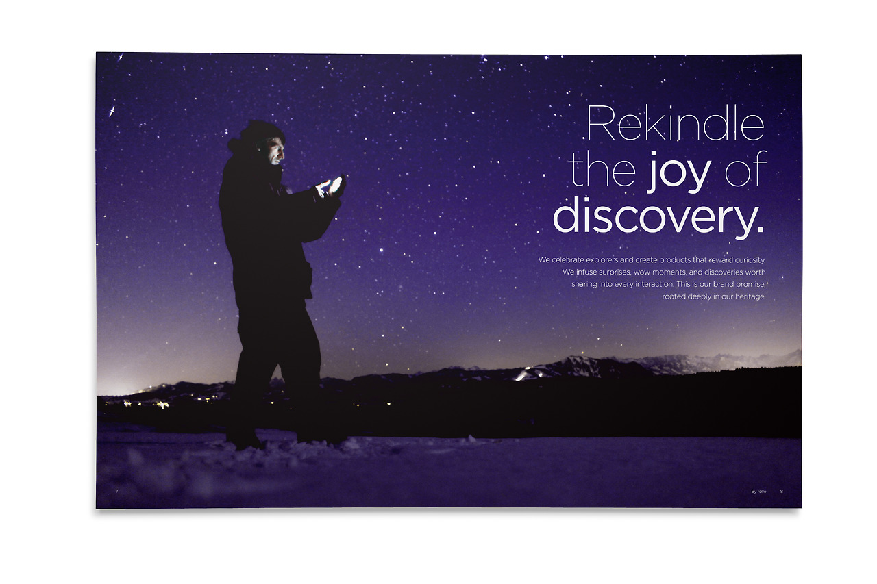
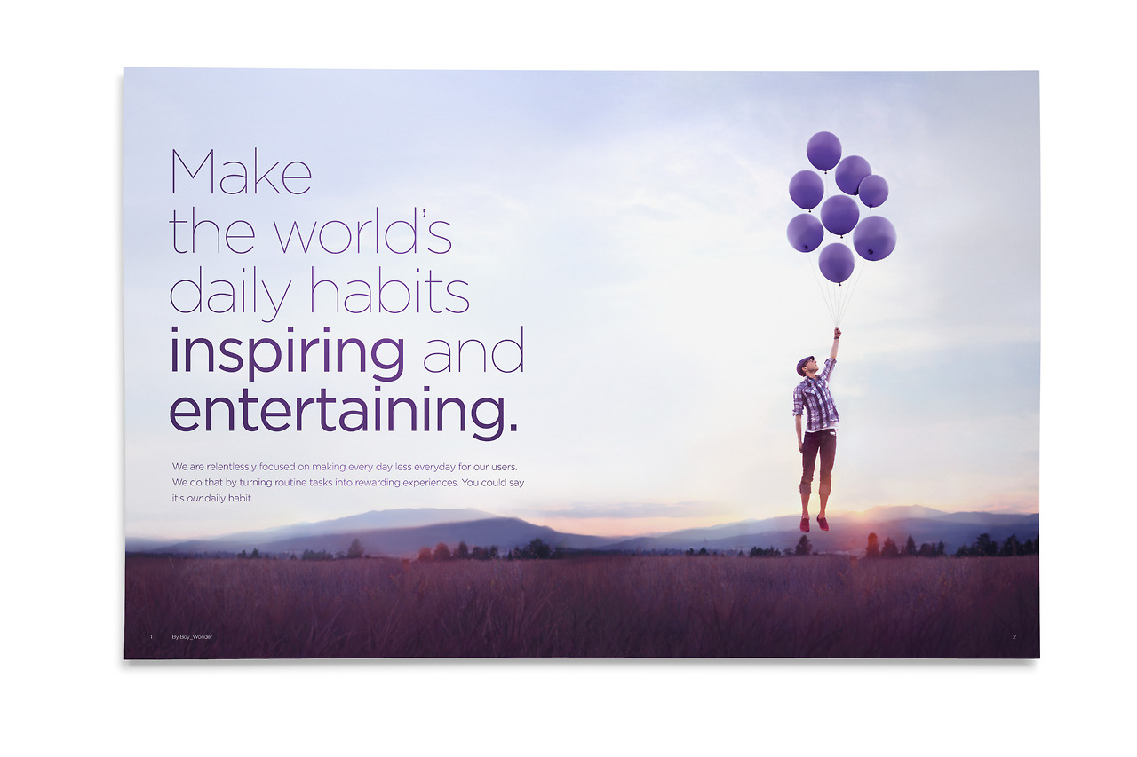
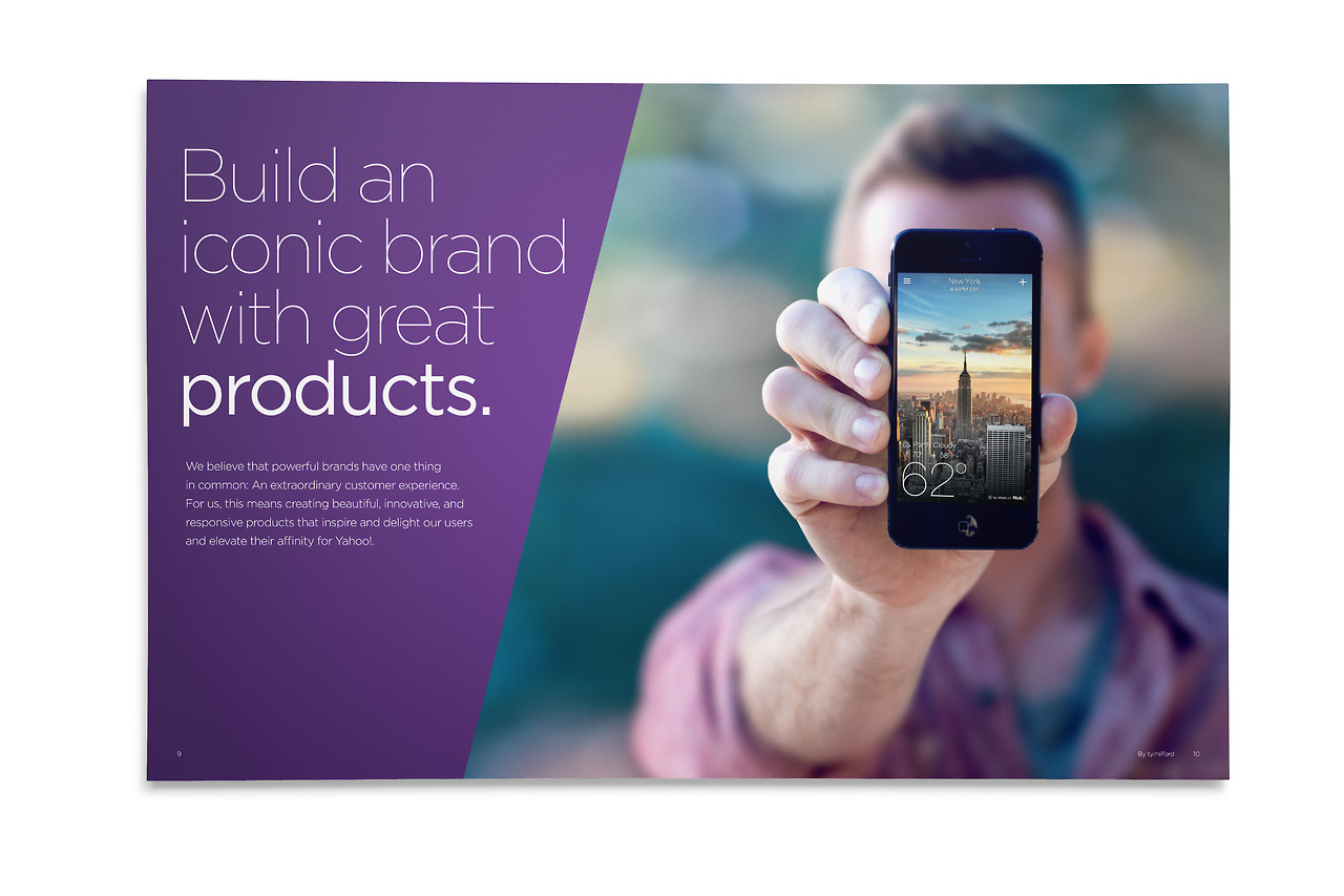
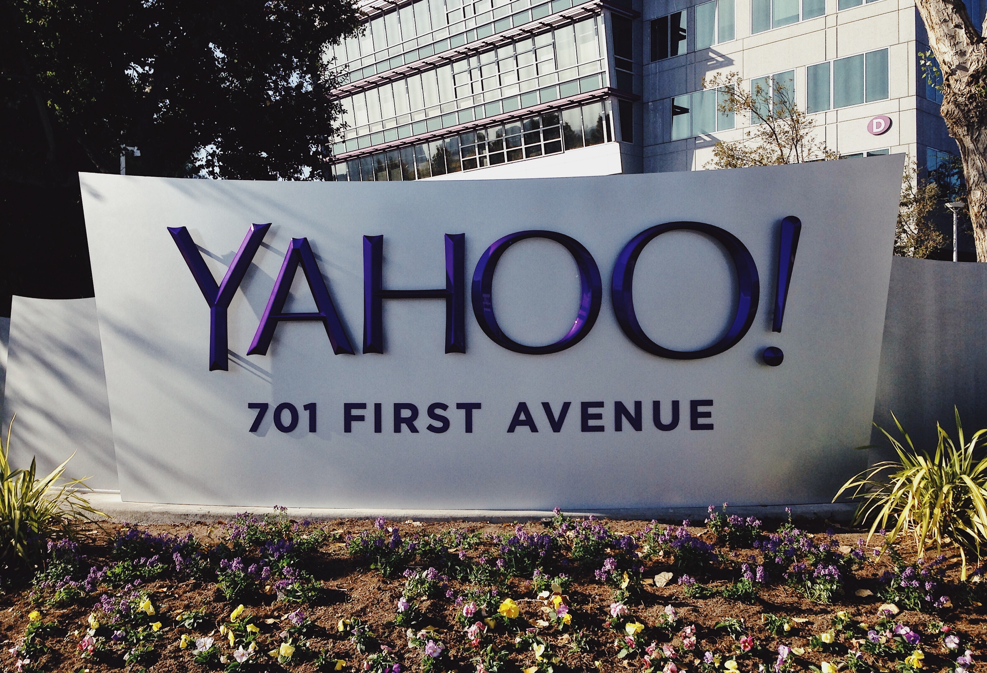
Months after appointing new CEO Marissa Mayer (ex-Google) and on the coat tails of winning an Apple Design Award for their newly designed Weather App, it was time for Yahoo! to plant a new firm foot in the ground and update their identity to align with the new direction of the company. Yahoo's new aim under Mayer was a strong push into mobile apps, her goal was to make the world's daily habits more inspiring and entertaining. Myself and the brand team set out to shed some of the quirkiness of the original identity, and bring more relevant sophistication, all while maintaing elements of Yahoo!'s personality and character.
REBRANDING A TECH GIANT
A New Direction
Months after appointing new CEO Marissa Mayer (ex-Google) and on the coat tails of winning an Apple Design Award for their newly designed Weather App, it was time for Yahoo! to plant a new firm foot in the ground and update their identity to align with the new direction of the company. Yahoo's new aim under Mayer was a strong push into mobile apps, her goal was to make the world's daily habits more inspiring and entertaining. Myself and the brand team set out to shed some of the quirkiness of the original identity, and bring more relevant sophistication, all while maintaing elements of Yahoo!'s personality and character.
NEW BRAND TENNANTS
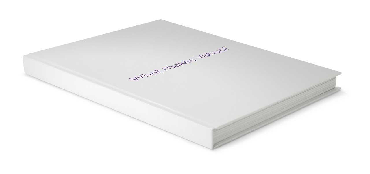
Yahoo! Brand Book
To establish the new vision for Yahoo!, we needed to put it in writing. The brand team worked closely with the C-Suite and senior leadership teams to develop new tennants for the brand. These became solidified in the creation of a brand book for the company.
NEW BRAND TENNANTS
Yahoo! Brand Book
To establish the new vision for Yahoo!, we needed to put it in writing. The brand team worked closely with the C-Suite and senior leadership teams to develop new tennants for the brand. These became solidified in the creation of a brand book for the company.
LOGO EXPLORATION
What Makes Yahoo! so Yahoo?
I lead and managed teams of both branding designers in the NYC office, and the marketing - advertising art directors in the Sunnyvale, CA Headquarters, all who contributed concepts for
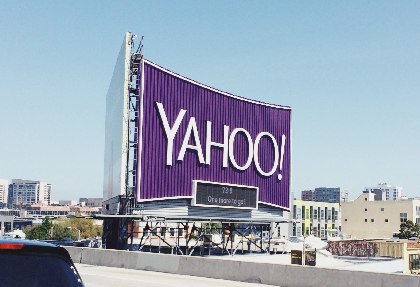
the new identity. Lots of great ideas were genrated, which brought lots of excitement and attention within the walls of the company. Being an irreverant brand, Yahoo! capitilized on the excitement and turned our team's explorations into a 30 day identity launch, teasing a new logo concept each day during the month of August 2013, launching the new final identity on Septermber 1st.
LOGO EXPLORATION
What Makes Yahoo! so Yahoo?
I lead and managed teams of both branding designers in the NYC office, and the marketing - advertising art directors in the Sunnyvale, CA Headquarters, all who contributed concepts for the new identity. Lots of great ideas were genrated, which brought lots of excitement and attention within the walls of the company. Being an irreverant brand, Yahoo! capitilized on the excitement and turned our team's explorations into a 30 day identity launch, teasing a new logo concept each day during the month of August 2013, launching the new final identity on Septermber 1st.
LOGO EXPLORATION
What Makes Yahoo!
so Yahoo?
I lead and managed teams of both branding designers in the NYC office, and the marketing - advertising art directors in the Sunnyvale, CA Headquarters, all who contributed concepts for
the new identity. Lots of great ideas were genrated, which brought lots of excitement and attention within the wall of Yahoo. Being an irreverant company, Yahoo! capitilized on the excitement and turned our team's explorations into a 30 day identity launch, teasing a new logo concept each day during the month of August 2013, launching the new final identity on Septermber 1st.

CEO GETS HER HANDS DIRTY
Geeking Out on the Logo
Marissa Mayer
"We knew we wanted a logo that reflected Yahoo - whimsical, yet sophisticated. Modern and fresh, with a nod to our history. Having a human touch, personal. Proud.
Other elements fell quickly into place:
- We didn’t want to have any straight lines in the logo. Straight lines don’t exist in the human form and are extremely rare in nature, so the human touch in the logo is that all the lines and forms all have at least a slight curve.
- We preferred letters that had thicker and thinner strokes - conveying the subjective and editorial nature of some of what we do.
- Serifs were a big part of our old logo. It felt wrong to give them up altogether so we went for a sans serif font with “scallops” on the ends of the letters.
- Our existing logo felt like the iconic Yahoo yodel. We wanted to preserve that and do something playful with the OO’s.
- We wanted there to be a mathematical consistency to the logo, really pulling it together into one coherent mark.
- We toyed with lowercase and sentence case letters. But, in the end, we felt the logo was most readable when it was all uppercase, especially on small screens."
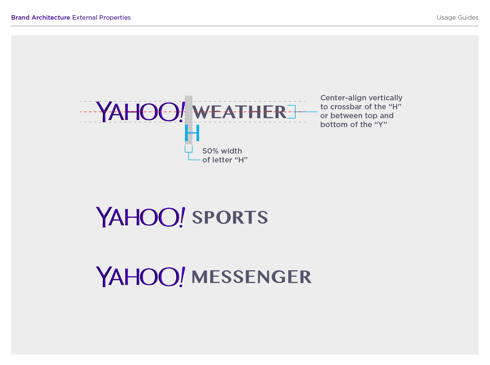
"Our last move was to tilt the exclamation point by 9 degrees, just to add a bit of whimsy.
Prior to the weekend, we had also polled our employees on the changes they wanted to see. Interestingly, 87% of our employees wanted some type of change in the logo (either iterative or radical). In terms of specific attributes, our employees had wanted:
- sans serif
- variable size letters
- a variable baseline
- a tilted exclamation point
- and the majority of their favorite logos were uppercase.
While we hadn’t set out to explicitly fill each request, we met a lot of what the people who know us best felt suited us best.
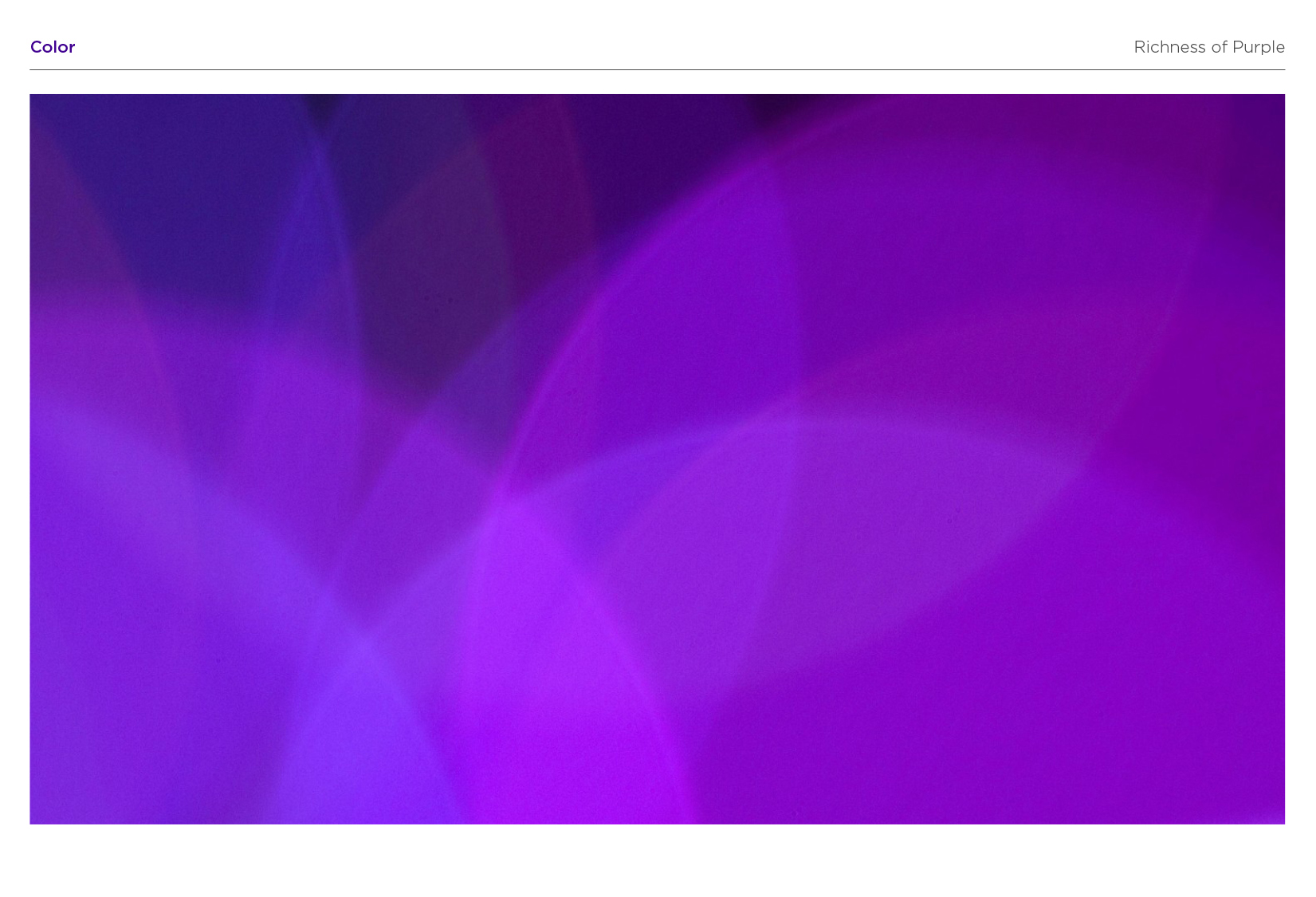
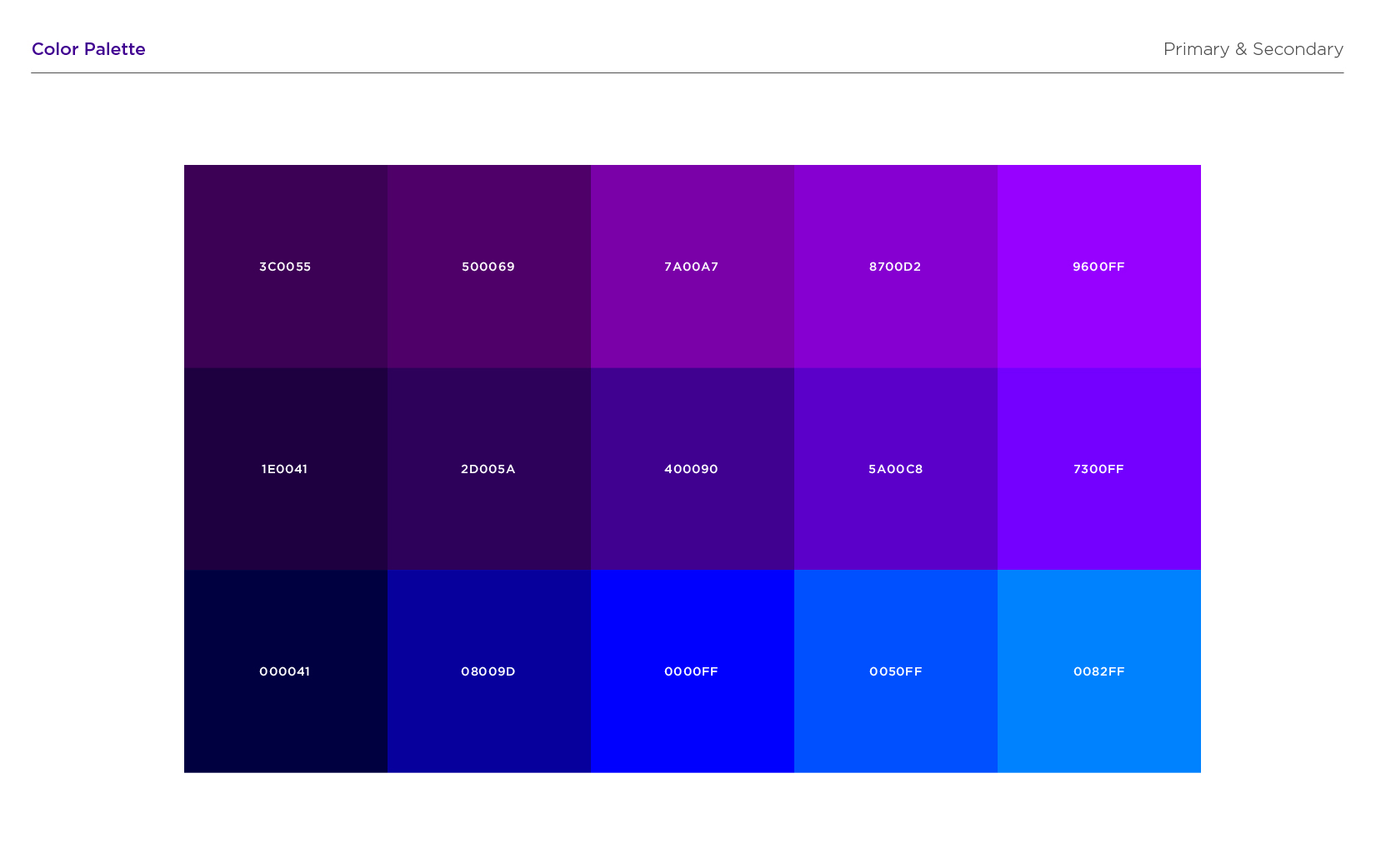
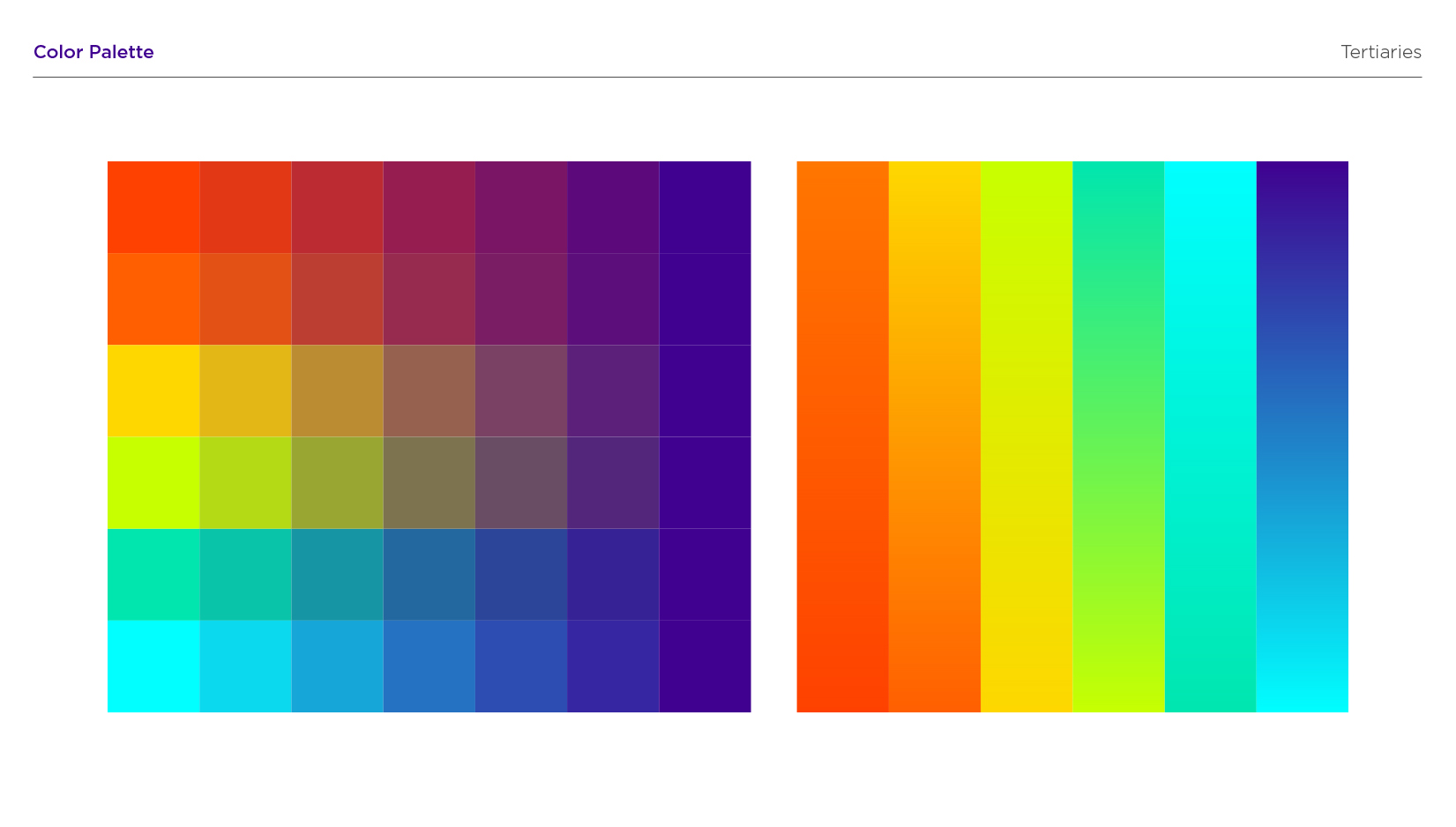
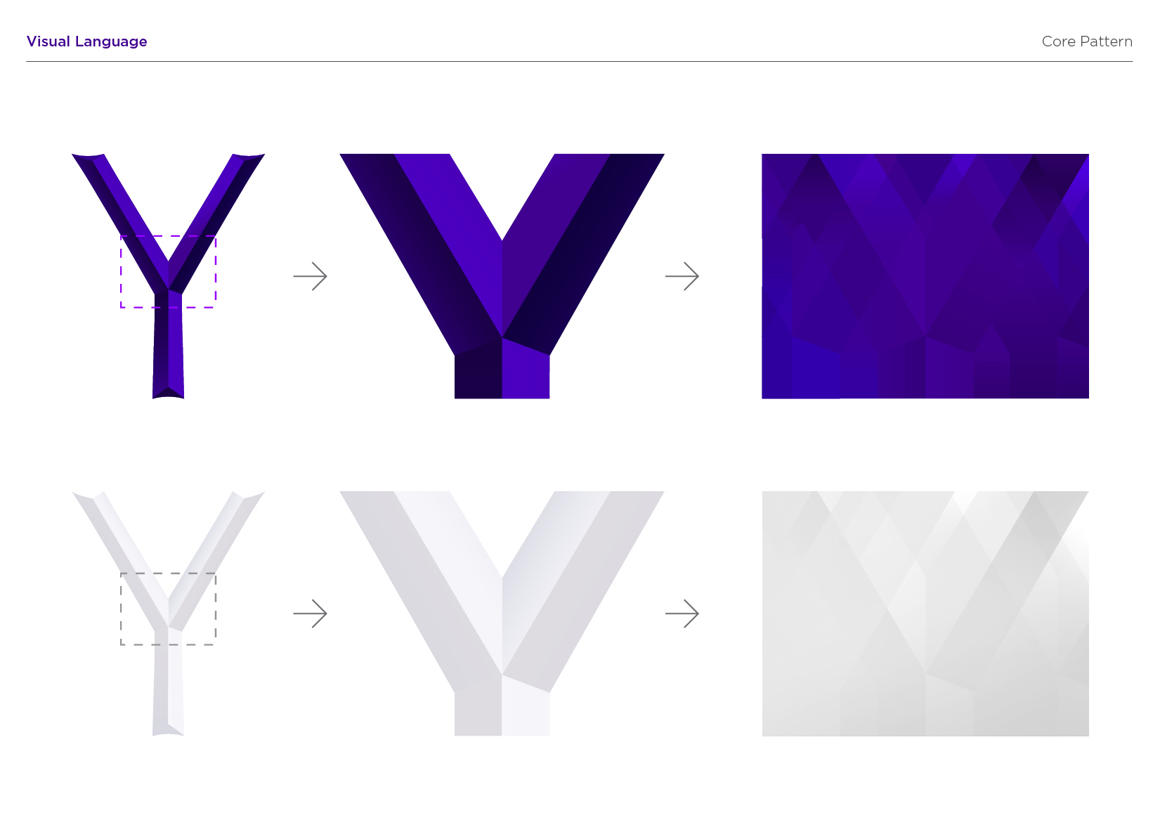
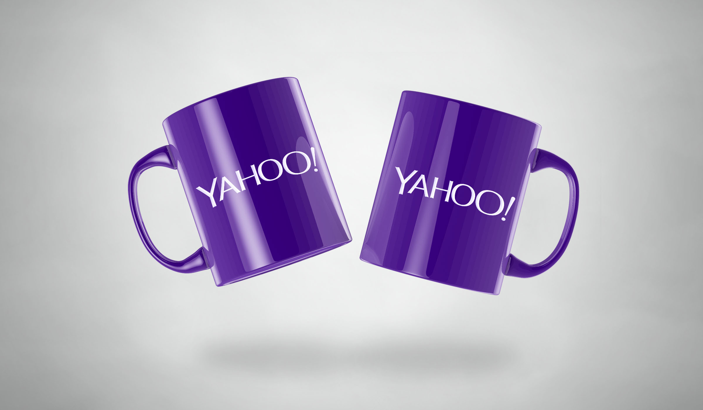
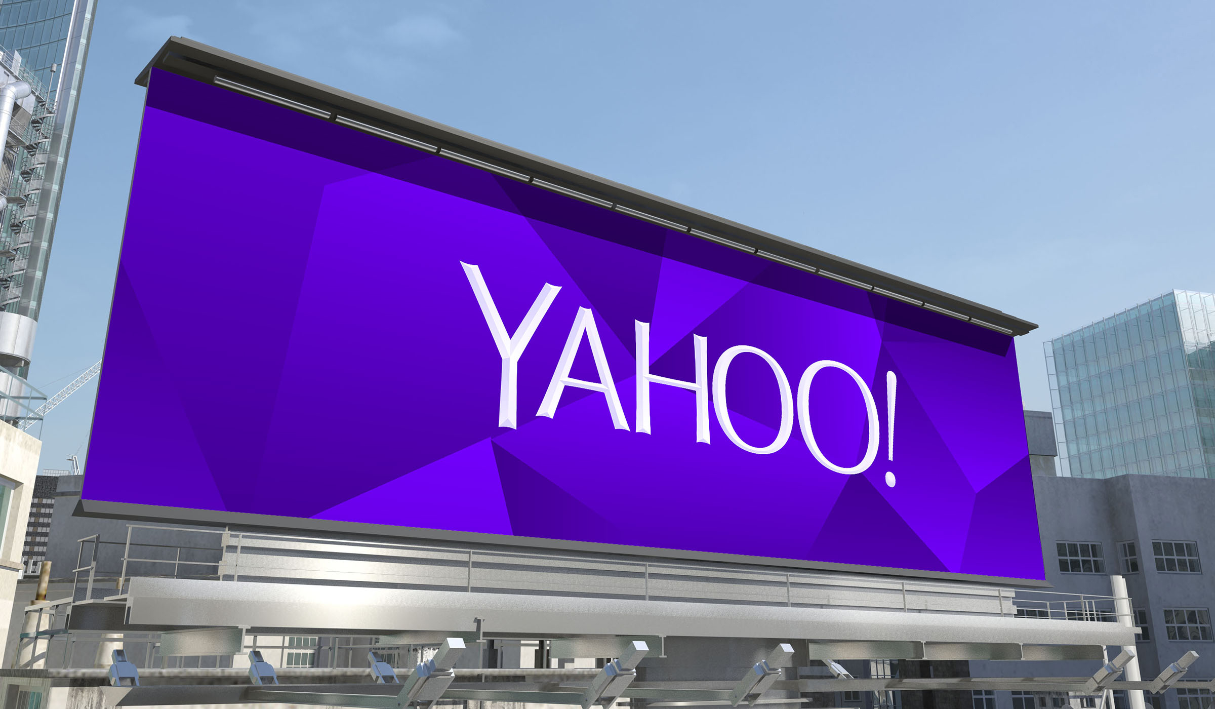
Color and texture were pretty easy. Our purple is Pantone Violet C - a pantone that needs no number and no introduction ;). For the texture, we came up with the nice idea of creating a chiseled triangular depth to the logo - this causes the letter Y to appear in the shading at the ends of each of the letters.
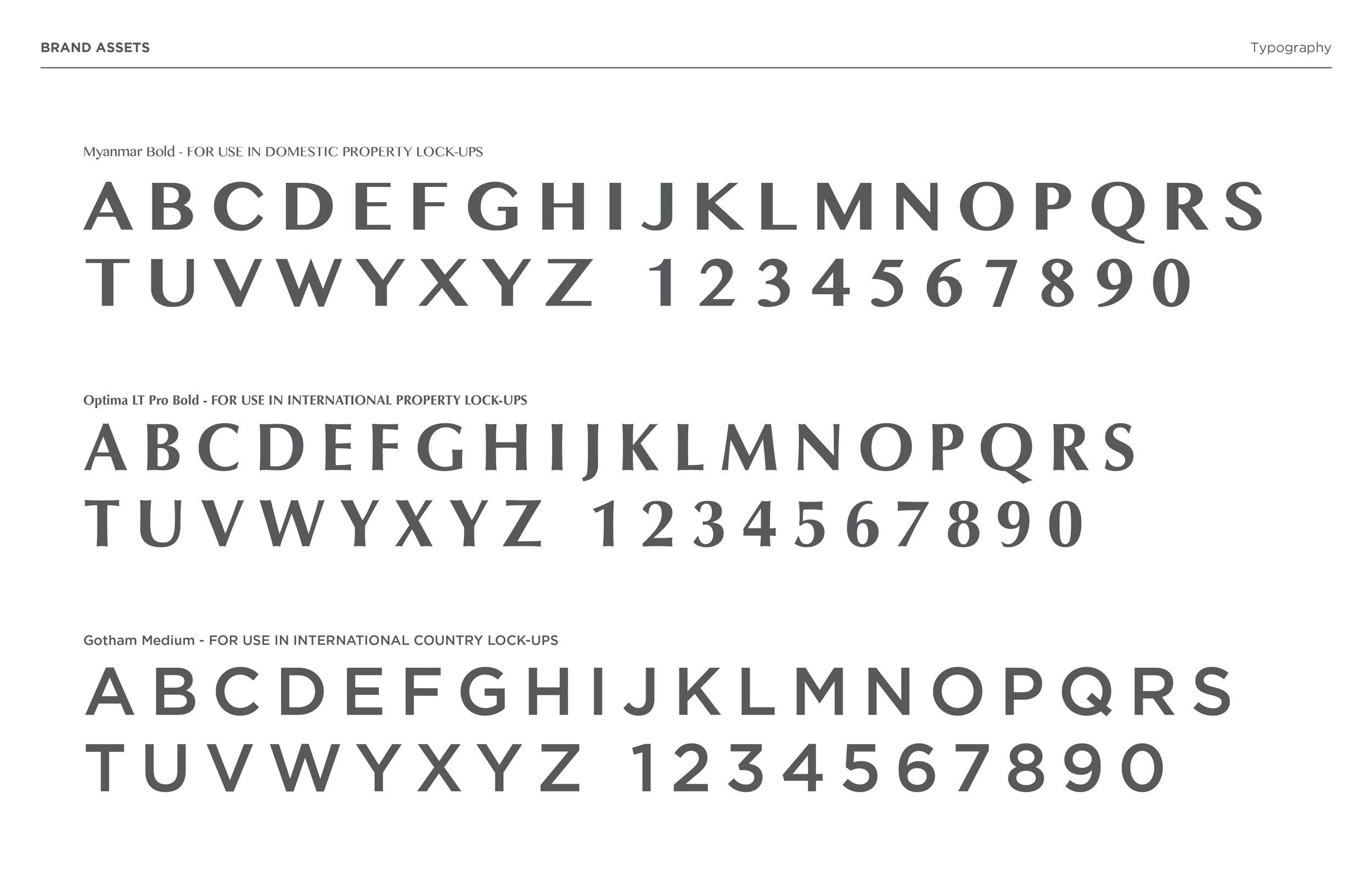
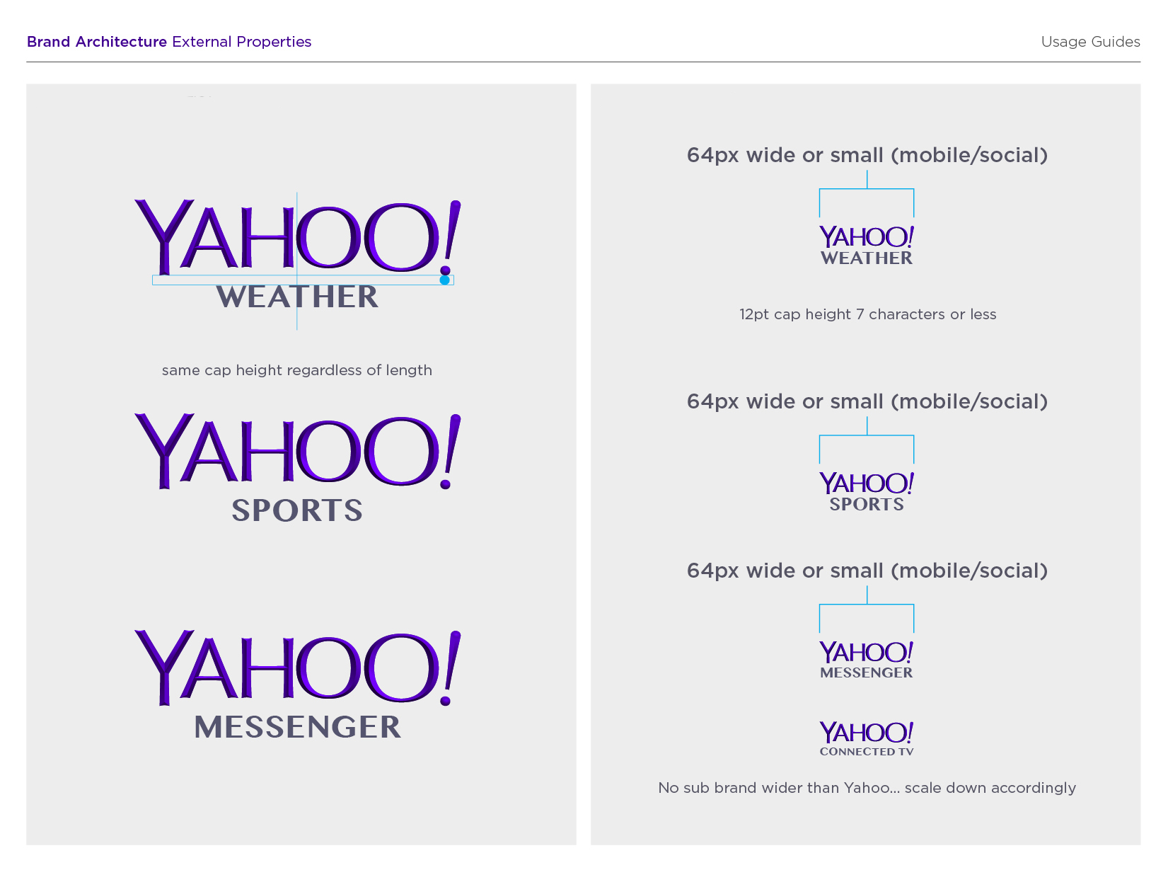
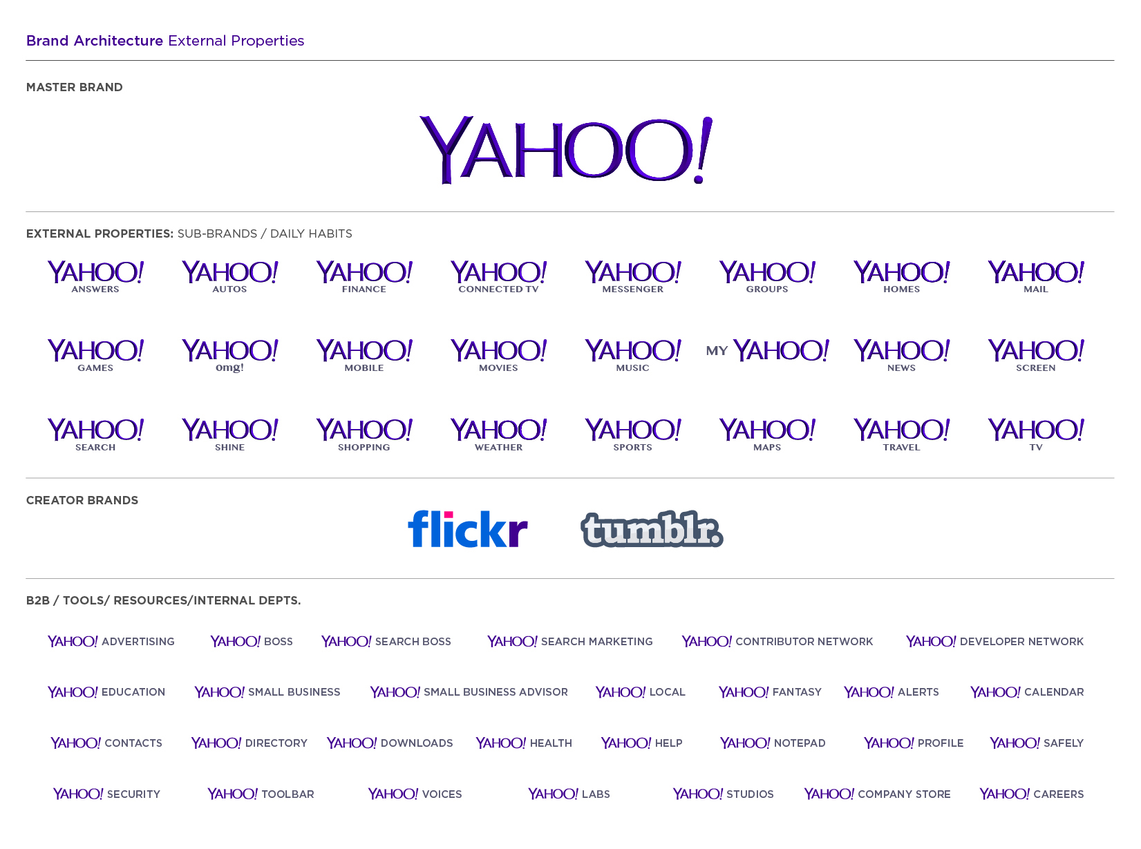
Over the subsequent weeks, we’ve worked on various applications and treatments of the logo (the favicon, app launchers, sub-brand lockups).
It’s held up well. And, while moving forward we’re likely to make small iterative changes along the way rather than dramatic ones, we’re really happy with where we ended up. We hope you are too!"
"Our last move was to tilt the exclamation point by 9 degrees, just to add a bit of whimsy.
Prior to the weekend, we had also polled our employees on the changes they wanted to see. Interestingly, 87% of our employees wanted some type of change in the logo (either iterative or radical). In terms of specific attributes, our employees had wanted:
- sans serif
- variable size letters
- a variable baseline
- a tilted exclamation point
- and the majority of their favorite logos were uppercase.
While we hadn’t set out to explicitly fill each request, we met a lot of what the people who know us best felt suited us best.
Color and texture were pretty easy. Our purple is Pantone Violet C - a pantone that needs no number and no introduction ;). For the texture, we came up with the nice idea of creating a chiseled triangular depth to the logo - this causes the letter Y to appear in the shading at the ends of each of the letters.
Over the subsequent weeks, we’ve worked on various applications and treatments of the logo (the favicon, app launchers, sub-brand lockups). It’s held up well. And, while moving forward we’re likely to make small iterative changes along the way rather than dramatic ones, we’re really happy with where we ended up. We hope you are too!"
"Our last move was to tilt the exclamation point by 9 degrees, just to add a bit of whimsy.
Prior to the weekend, we had also polled our employees on the changes they wanted to see. Interestingly, 87% of our employees wanted some type of change in the logo (either iterative or radical). In terms of specific attributes, our employees had wanted:
- sans serif
- variable size letters
- a variable baseline
- a tilted exclamation point
- and the majority of their favorite logos were uppercase.
While we hadn’t set out to explicitly fill each request, we met a lot of what the people who know us best felt suited us best.
Color and texture were pretty easy. Our purple is Pantone Violet C - a pantone that needs no number and no introduction ;). For the texture, we came up with the nice idea of creating a chiseled triangular depth to the logo - this causes the letter Y to appear in the shading at the ends of each of the letters.
Over the subsequent weeks, we’ve worked on various applications and treatments of the logo (the favicon, app launchers, sub-brand lockups).
It’s held up well. And, while moving forward we’re likely to make small iterative changes along the way rather than dramatic ones, we’re really happy with where we ended up. We hope you are too!"
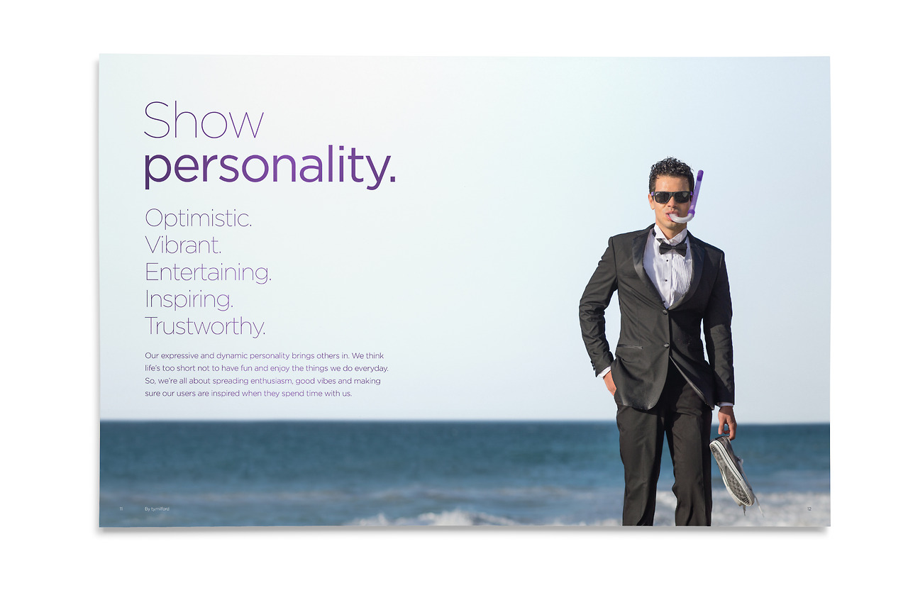
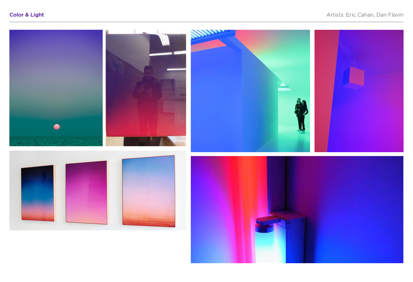
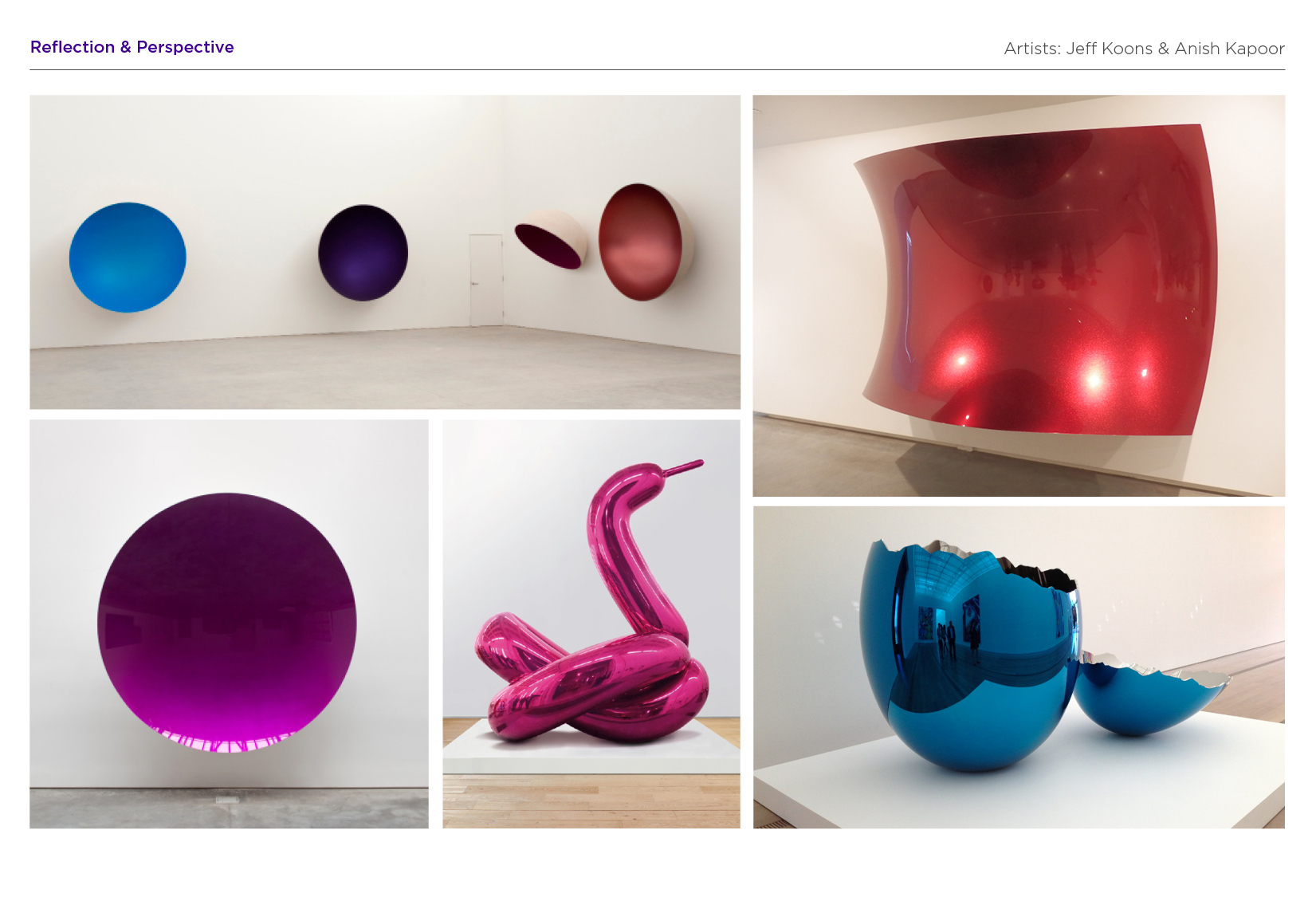
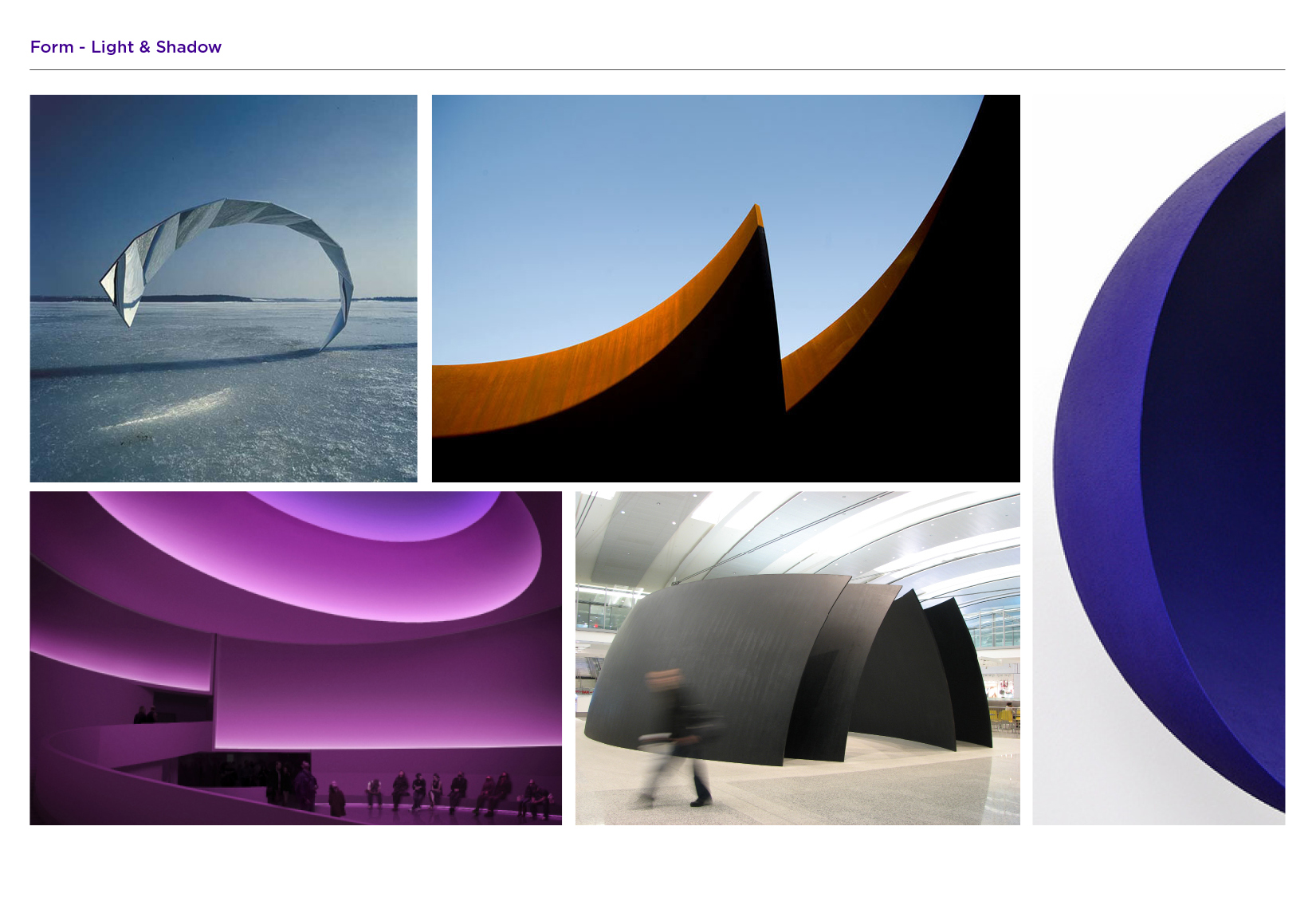
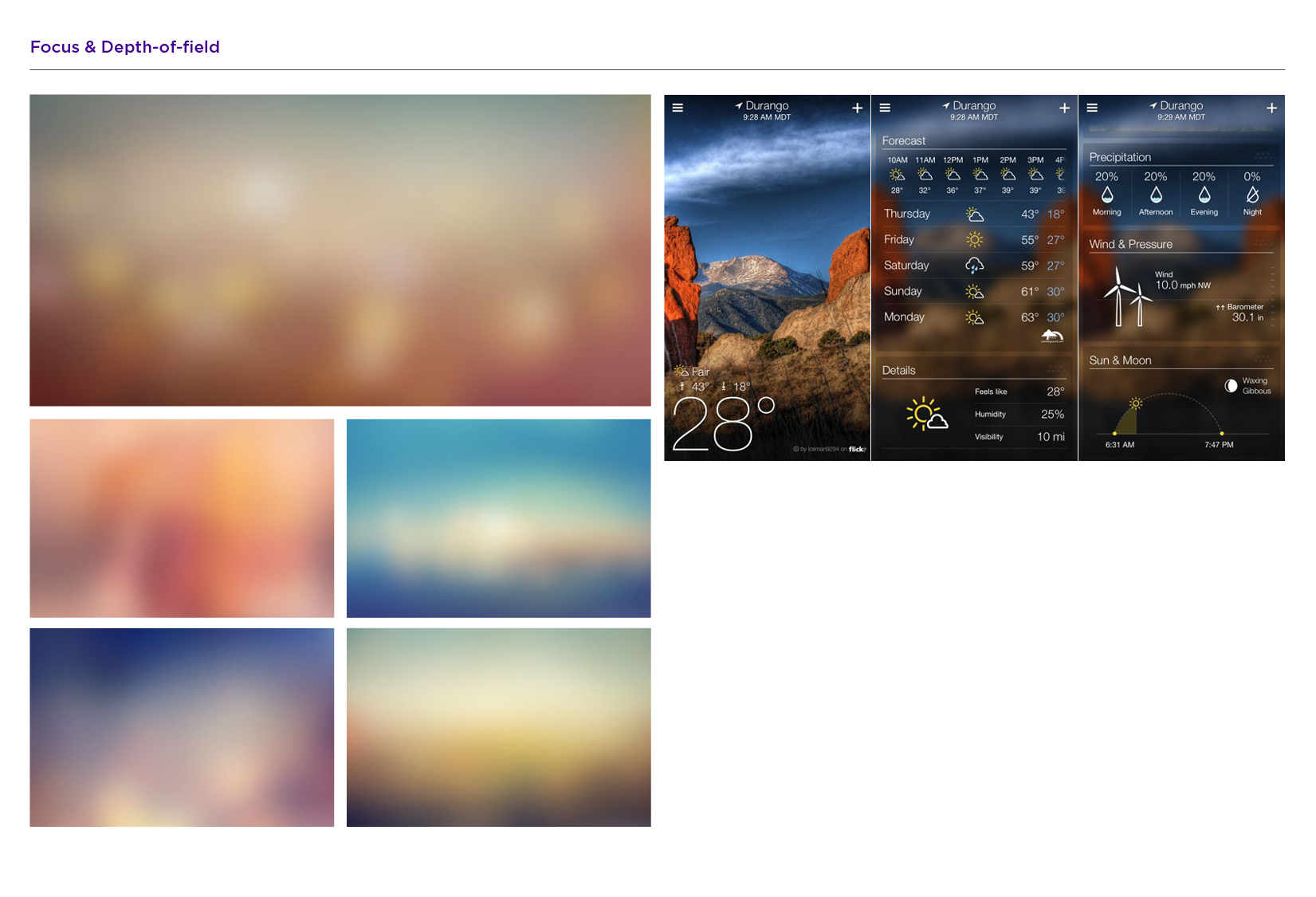
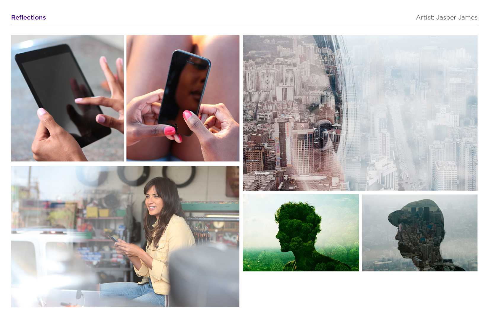
INSPIRATION
Mood & Style for the New Identity
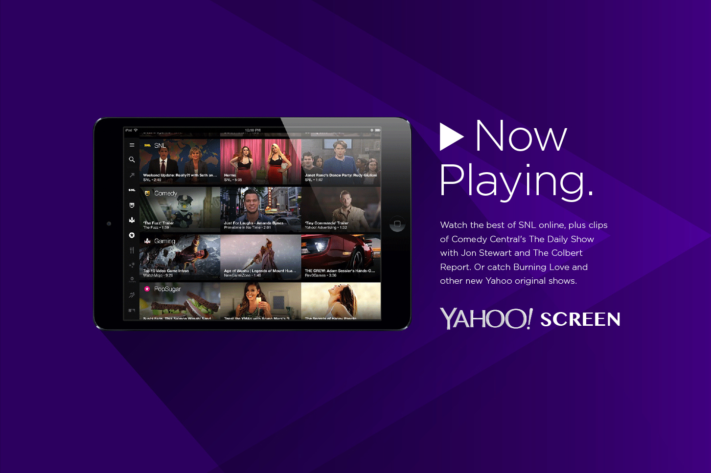
BRAND ASSETS
New Identity System
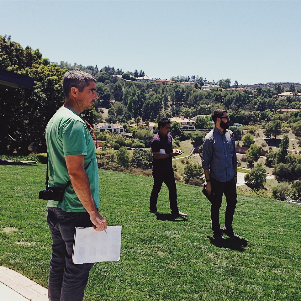
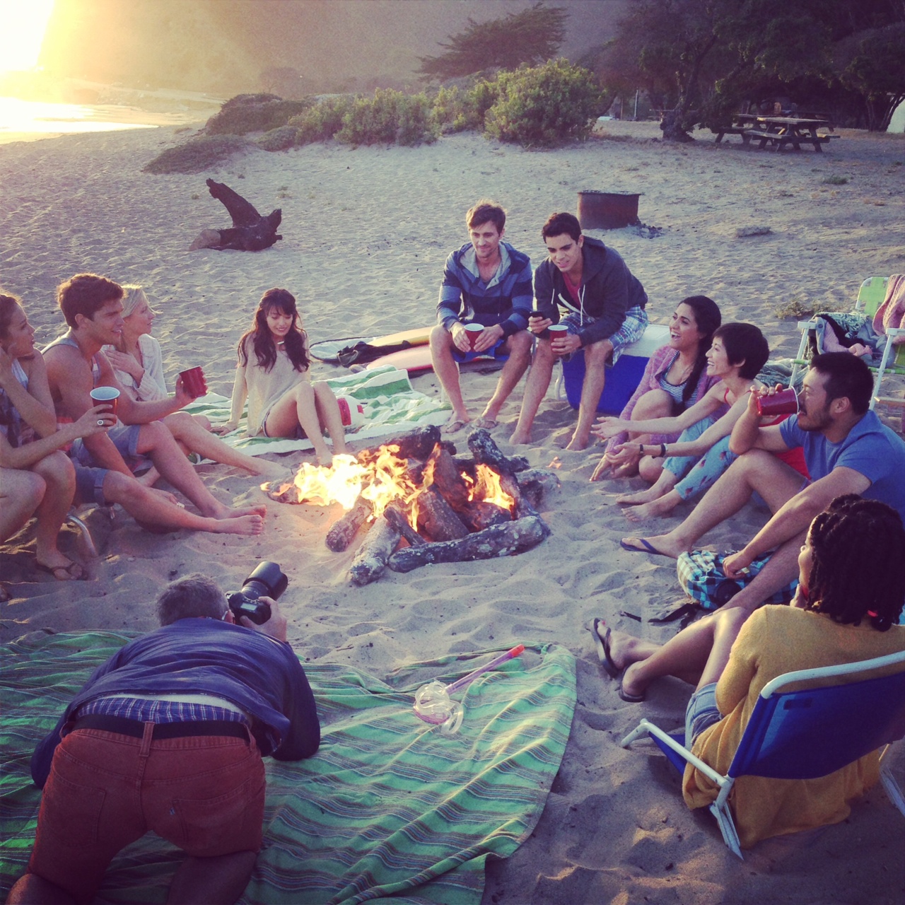
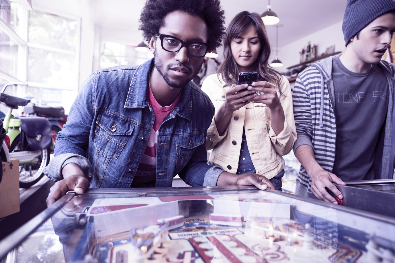
PHOTOSHOOT WITH TY MILFORD
3 Days, 6 Locations, Los Angeles, CA


CLIENT
AGENCY
YEAR
Yahoo!
In-House Brand Team
2013
Yahoo!
In-House Brand Team
2013
MY ROLE
Brand Director
Brand Director
PROJECT
Identity, Brand Strategy, Brand Architecture, Photoshoot
TEAM
Marissa Mayer, Kathy Savitt, Bob Stohrer, Marc Debartelomeis, Kara Krushin, Joel Wasserman, Ryan Clifford,
Nathan Bachmann, Ryan Aquino, Jared Kozel, Russ Khaydarov, Max Ma, Brad Hall, Ivan Cayabyab
Marissa Mayer, Kathy Savitt, Bob Stohrer, Marc Debartelomeis, Kara Krushin, Joel Wasserman, Ryan Clifford, Nathan Bachmann, Ryan Aquino, Jared Kozel, Russ Khaydarov, Max Ma, Brad Hall,
Ivan Cayabyab
Marissa Mayer, Kathy Savitt, Bob Stohrer, Marc Debartelomeis, Kara Krushin, Joel Wasserman, Ryan Clifford, Nathan Bachmann, Ryan Aquino, Jared Kozel, Russ Khaydarov, Max Ma, Brad Hall, Ivan Cayabyab
Featured Projects
MerativeBrand Identity, Visual System, Website, Launch Campaign
IBM Cloud for Financial ServicesB2B Campaign, Illustration, Icons
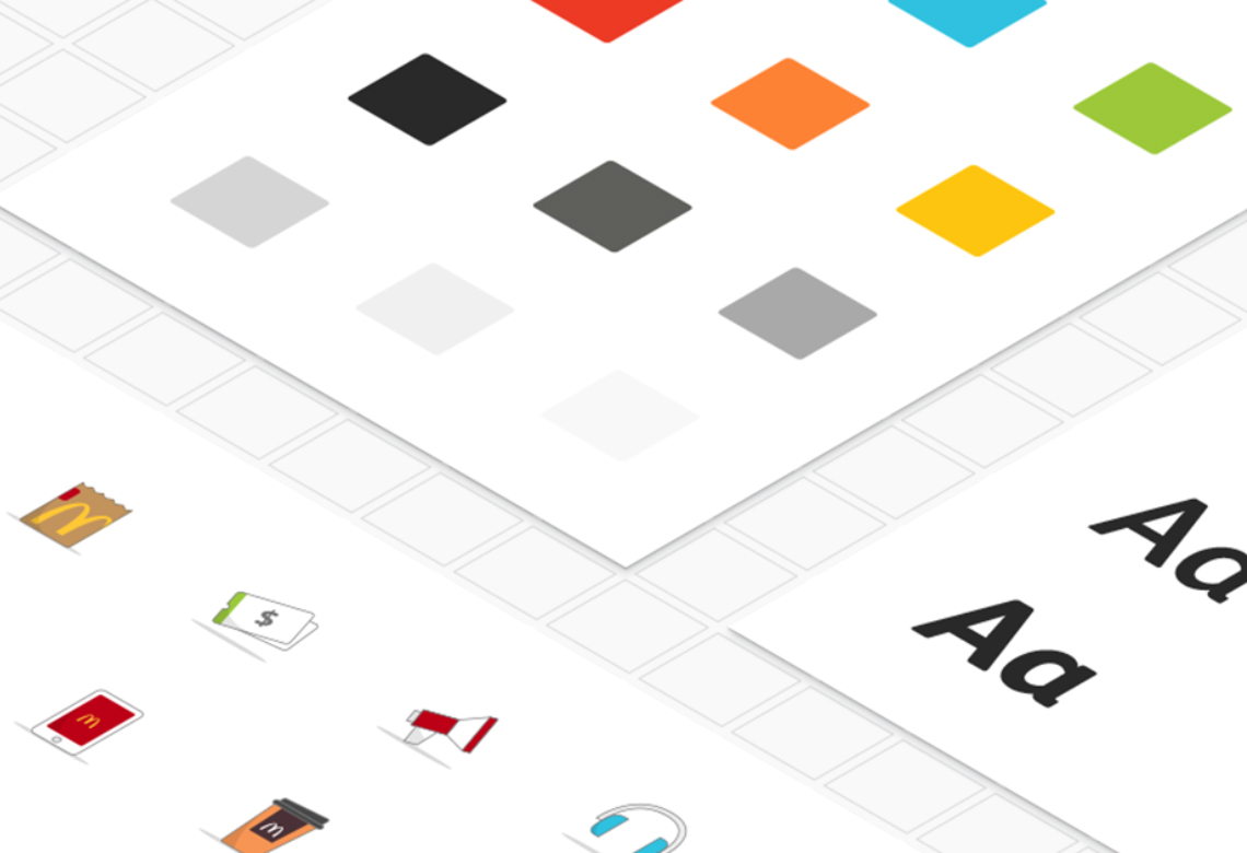
McDonald's Global Digital Design SystemDigital Design, UI Kit
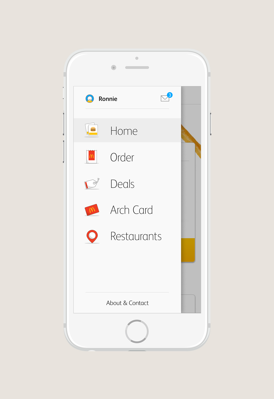
McDonald's Digital Omni-Channel ExperienceUX Design, Mobile App, Digital Prototyping
Modern FlowerBrand Identity, Packaging
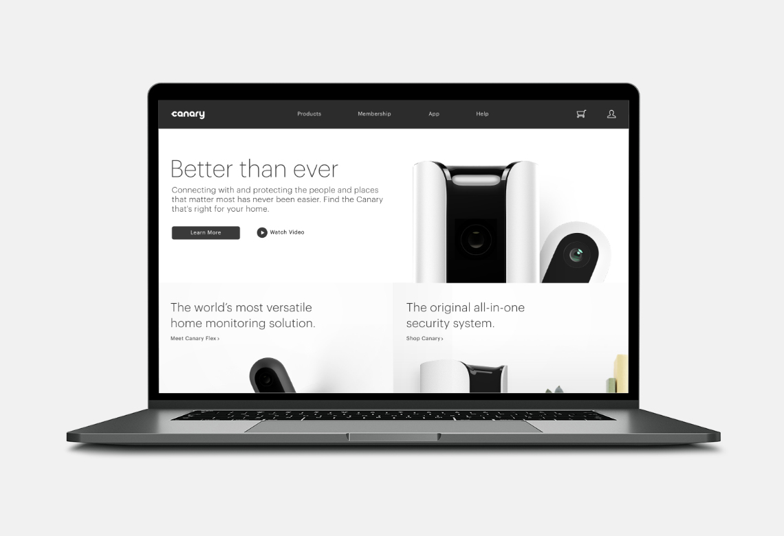
Canary WebsiteE-commerce Site
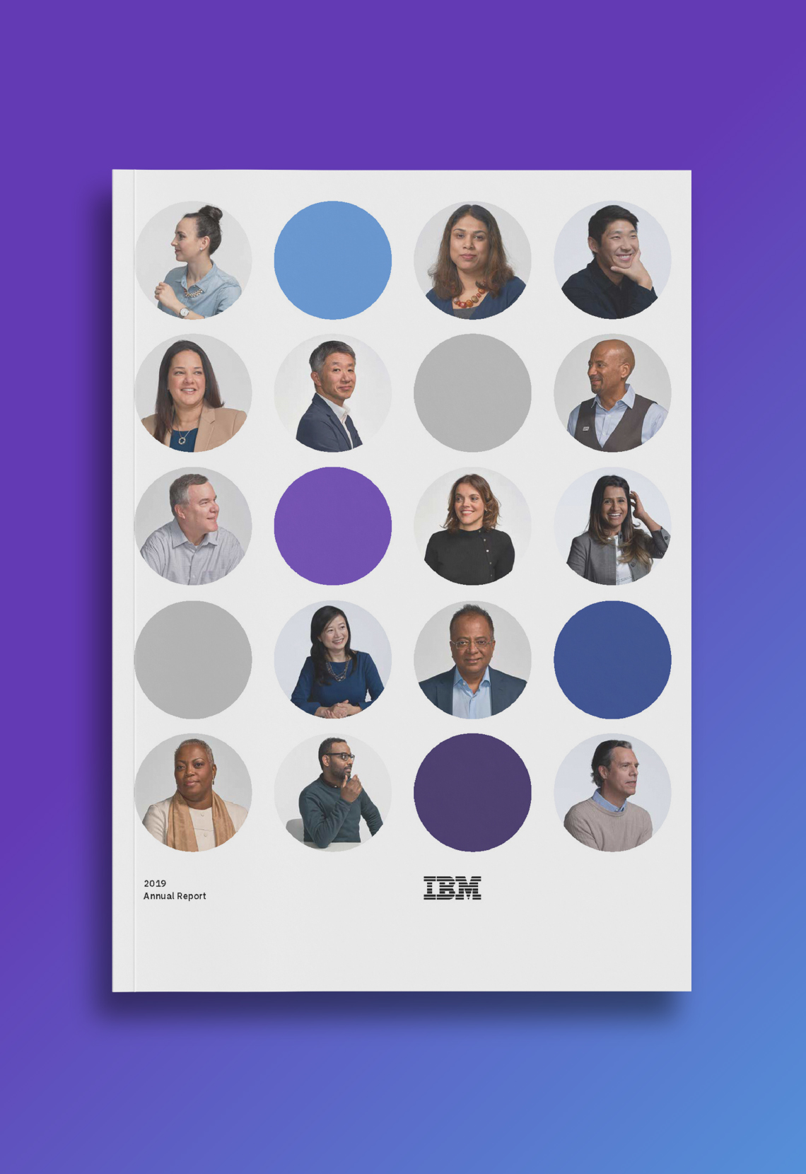
2019 IBM Annual ReportPrint, Layout, Editorial, Website
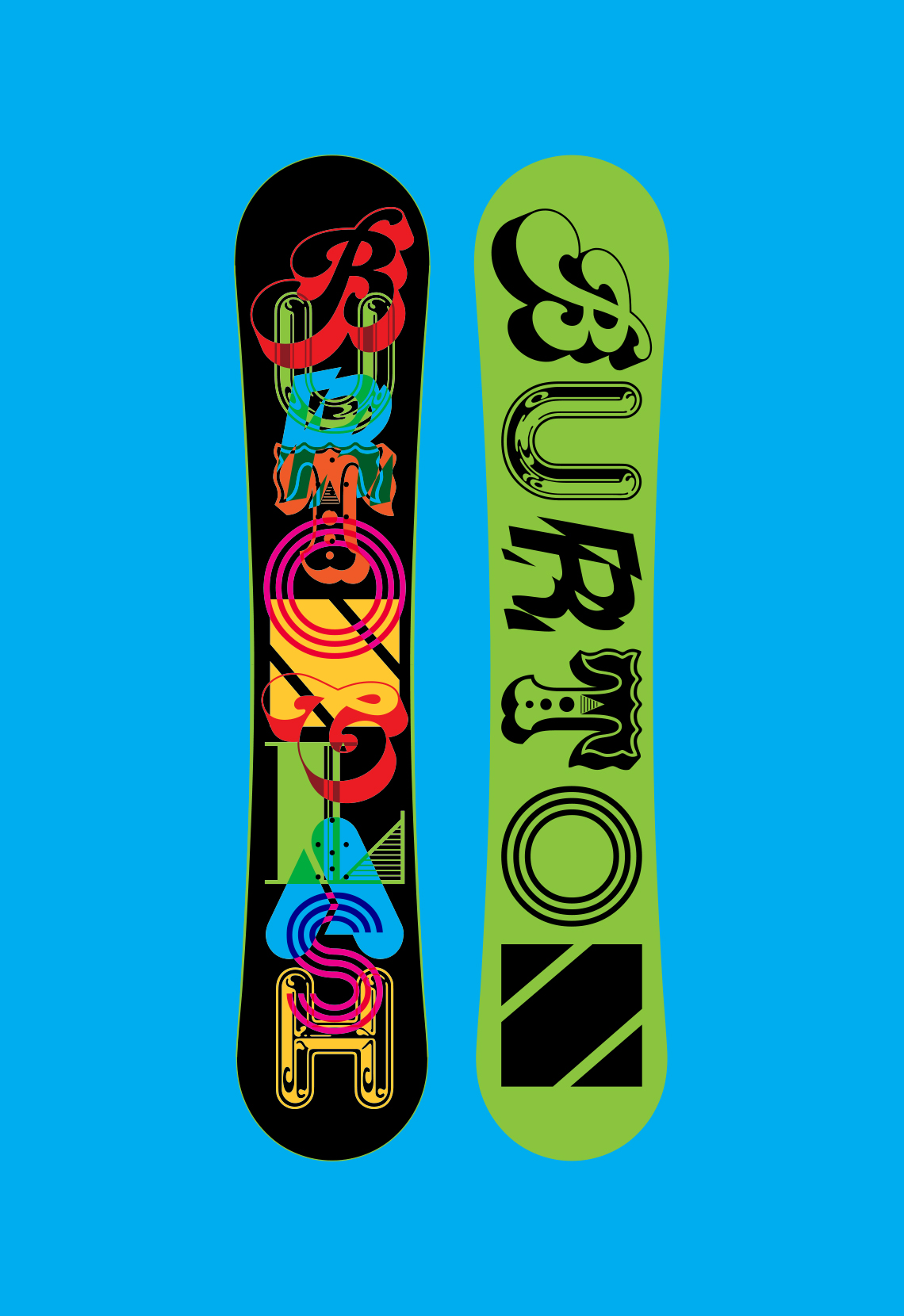
Burton Snowboards Clash ModelTypography, Illustration
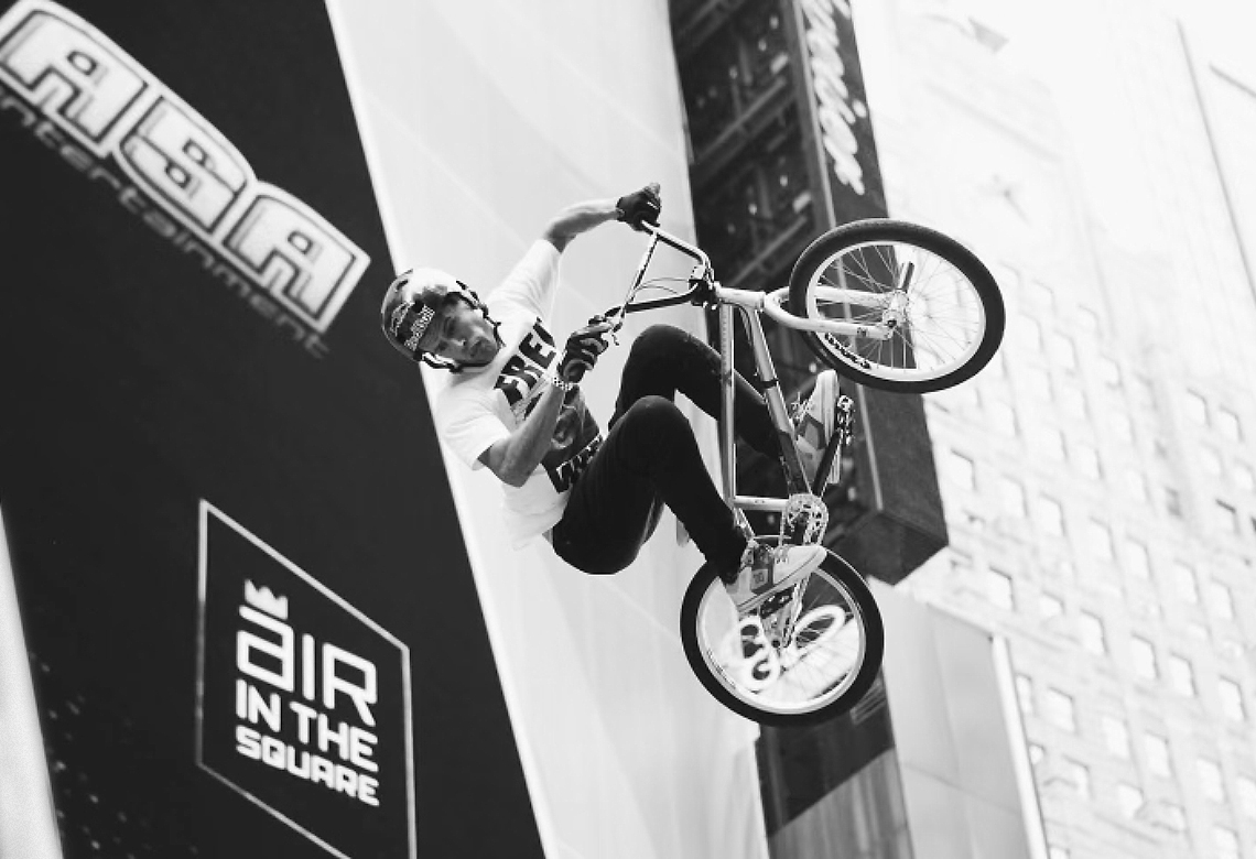
MSG Empire Open - Air In The SquareIdentity, Naming, Branding
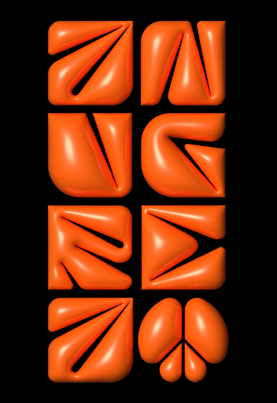
Aurange 3D TypeIllustration, Logo, Typography
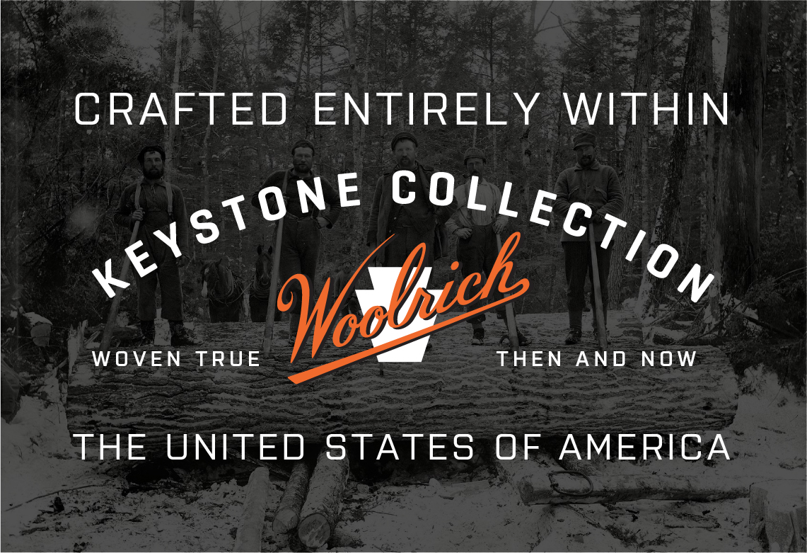
Woolrich - Keystone Collection U.S.A.Branding, Identity
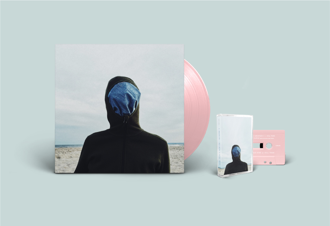
Not Here // Still There Album ReleaseMusic Composition, Photography, Packaging
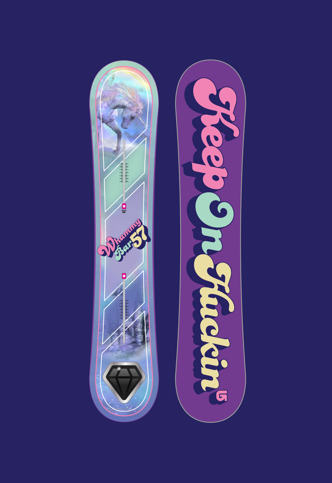
Burton Snowboards Whammy BarIllustration, Typography
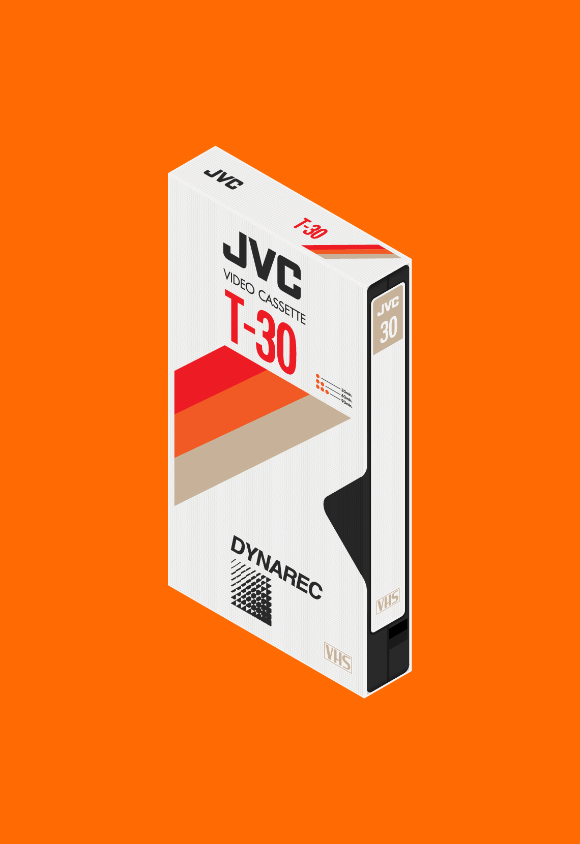
JVC VHS Isometric IllustrationIllustration

VW Camper Van Isometric IllustrationsIllustration
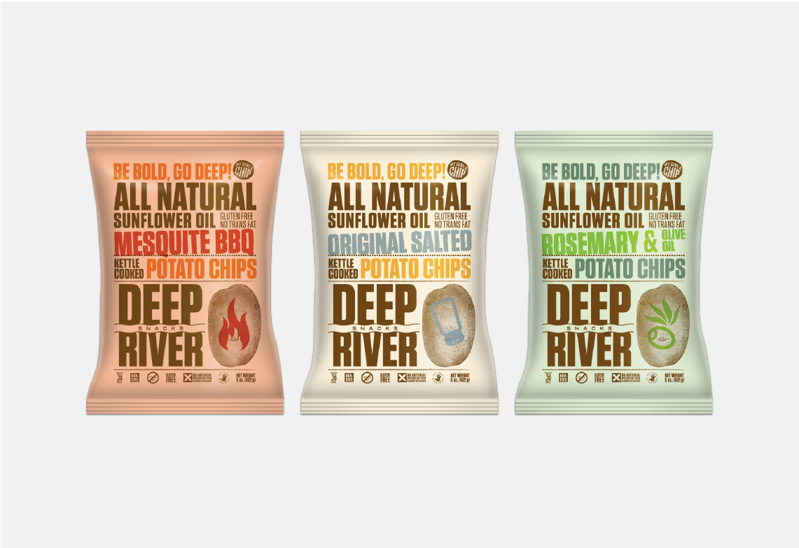
Deep River SnacksPackaging, Identity
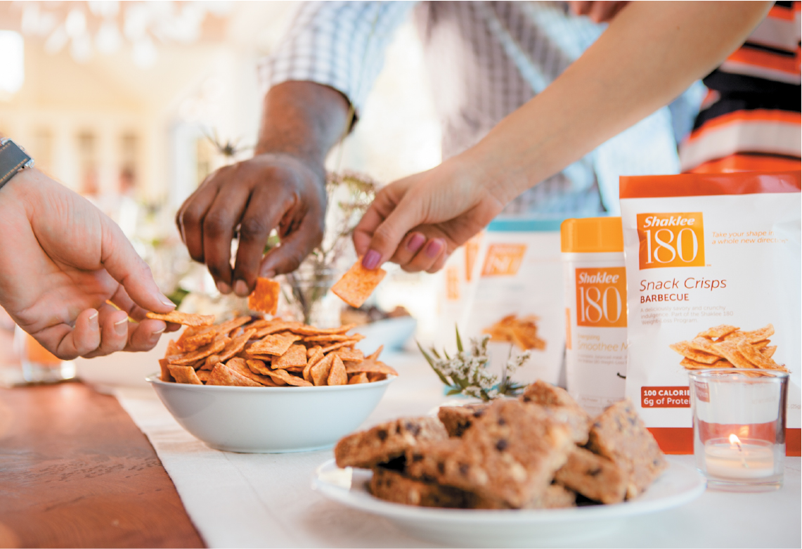
Shaklee 180 ProgramIdentity, Branding & Packaging
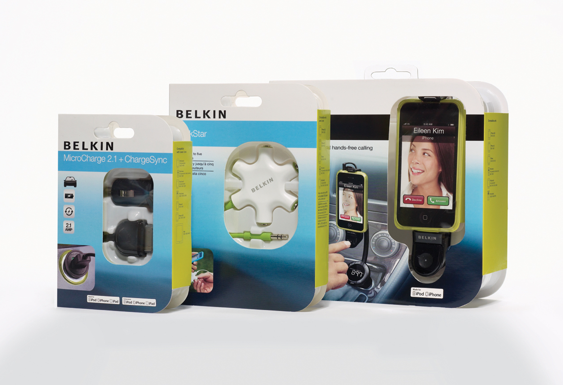
Belkin Packaging SystemPackaging
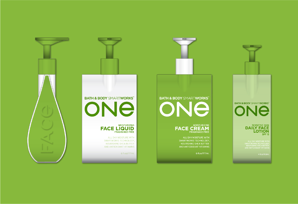
Bath & Body Smart WorksPackaging, Identity
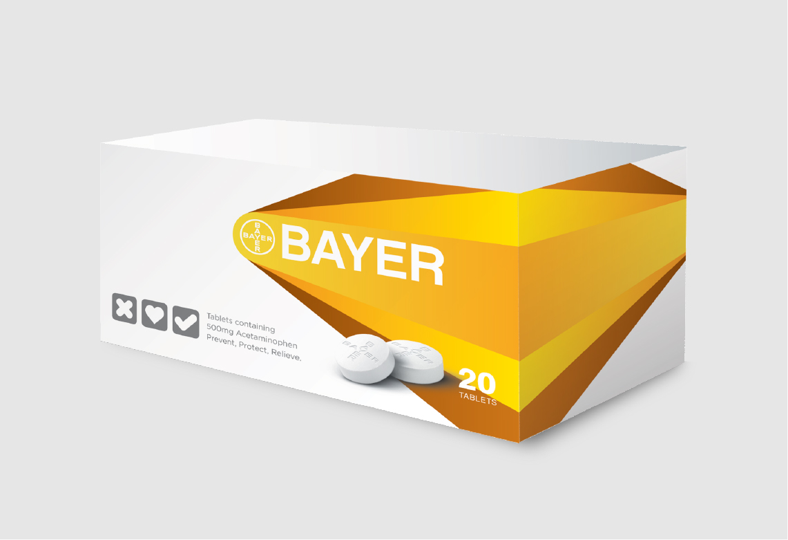
Bayer AspirinPackaging, Branding, OOH
© Adam Augustyn 2023